Why You Must Have Free Mobile Friendly Website Template?
Websites are the first thing you need when entering the digital world. If you think having social media presence is enough, then you are mistaken. Website is the official space on the internet for your work. Creating a website is not as easy as creating a social media profile. So there are templates to help you. You will find many web developer companies who sell templates for Wordpress website. But VWThemes stand out! Because it has range of free Mobile friendly website templates.
Yes! They have more than 110 free mobile friendly website templates. They all are made for different professions. Here in this article we are going to take a brief look at 50+ Free mobile friendly website templates by VWThemes!
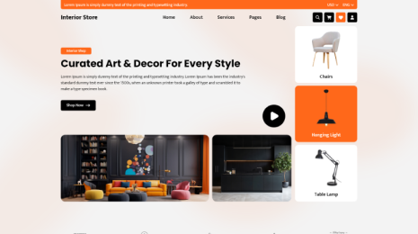
Free Bakery WordPress Theme

Who doesn’t like the baked goods! The baked food is a crucial part of our daily life. Your bakery is the way to get them. But to add a little bit of spice in your business, you need to get this free Bakery WordPress Theme. These Responsive WordPress Themes is what will take your bakery business to new heights. As mentioned it is free mobile friendly Wordpress template. So you don’t have to worry about the website’s performance on smartphones. Also you don’t have to pay anything to get this from VWThemes.
This free bakery WordPress Theme has a lot of exciting features. All of these features are premium but only here you are getting them for free. The most popular feature of this template is the layout. The web designers at VWThemes have made this template’s layout responsive and fast loading. Which helps you get higher SEO rank. The CTA buttons like ‘buy now’ or ‘subscribe now’ and more are there. The layout of this is decorated with attractive colors, styles, fonts, texts styles and background image. You have the liberty to make changed in it the way you want. It is built with the robust bootstrap framework which gives you hardcore coding strength.
This Bakery WordPress theme is built to be unhackable. So you don’t have to worry about the security of the website. In this layout the theme has different sections and templates. There are enough ready-to-use sections for you to create contact form, newsletter, about us and more. The templates are for the product descriptions. You can add image of your baked dishes and write description below it. There on the page you can also put social media icons where you can share the content of your free bakery Wordpress website.
Free Feminine WordPress Theme:-

The free Feminine WordPress theme is one of the bests in the industry. It is free mobile friendly website template. Just like the name suggests its main focus is on feminine beauty. This free mobile friendly website template is all about elegance, attractiveness, organized matters and strong functioning. You won’t find something like this on the internet.
Here you will get a lot of premium features for free. But you have to remember that it also requires to have some knowledge about Wordpress. To use this template you need to know how it works and what is needed to operate Wordpress website. This way you can explore more into this template. After this you will realize that every tool that you need to build and manage the website is already in free Feminine WordPress Theme.
This free mobile friendly WP theme is completely customizable. You can change whatever you want in it in just few simple clicks. This customization feature is very useful in making the website look like the way you wanted. It will represent your thoughts and your ambition about the business. This customization feature offers simple drag and drop functionality which will make everything easy. It will also make your Wordpress website a multipurpose website. Which can be used for any purpose. Just a few changes and it will become a whole new website. The customization also works pretty good on organizing your website once in a while.
Along with the mobile friendliness and customization it has a lot of exciting features that will not only enhance the look of your website but also the functioning of it. This free feminine Wordpress theme has bootstrap framework coding for the strong base. But due to customization feature you won’t need to make any changes into these core codes. So they are absolute.
Free Landscaping WordPress Theme:-

The greenery we see outside of our societies and offices are the work of art from the gardeners and landscapers. It is a work of patience. But you don’t have to be patient for your website establishment. This Free mobile friendly WP theme of free Landscaping Wordpress theme will do that in no time. This template doesn’t require much time and money as well. For all of this you will have to spend money only for the domain name. The host and theme will cost you nothing but a relaxed work time.
This free landscaping WordPress theme is one of the most efficient in it’s market. Just like actual gardening creating such elegant but strong website themes is also a work of art. The designer team at VWThemes has considered all the expectations from you. They made this Wordpress template exactly like that. That’s why this free mobile friendly website template fulfills all your wishes.
Greenery gives our eye a pleasant experience. That’s why we try to keep it in our home or around our home in the form of gardens. But to take good care of them or set them for us we need experts. But experts too need a medium to reach out. This free Garden and Landscaping theme can prove to be a helping hand here . You can create a professional yet attractive looking website with the help of this best WP theme.
In this free mobile friendly website template has a color palate to choose color for the layout and over 100 of font family option. You have all the liberty to make changes into the layout. Interestingly it is multipurpose and multilingual too. It can be accessed by any device on any browser. It is mobile friendly, browser friendly, user friendly and viewer friendly as well.
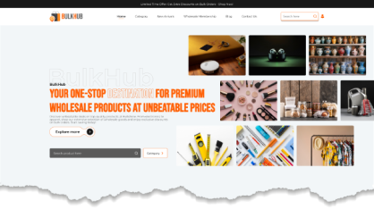
Free Grocery WordPress Theme:-

The part of our daily life are groceries. Its not just any part but the most important one we all work hard for. The traditional grocery stores feel fine until its global pandemic. In such times groceries made easy with websites. This free Grocery Wordpress theme will give you a simple solution for your grocery worries. It will help you building a website in no time and no money.
This free mobile friendly WordPress template is the perfect choice for your website. With the website you can sell groceries to people’s doorsteps and earn money on regular basis regardless of global pandemic. That’s the biggest thing that anyone would offer you. Because when every door is restricted to open, your shop will be open 24/7 for the people in need. This template is free of cost and is mobile friendly. Which means your website will be available for the viewers on all devices.
This free grocery WordPress theme has a lot of premium features that will blow your mind. This template is completely user friendly. It is basically designed the way you want. The designers have made each feature considering the need of the users. It is also viewer friendly. The viewers of your website will experience great speed, responsiveness, organized items and easy payment getaways.
Along with this the template is made with bootstrap framework. This will give you strong coded base. It will make it harder for the hackers to get into your system. But at the same time it is flexible with the changes. With the customization feature you will be able to make any changes you want in the layout of the website. With simple drag and drop functionality you can change colors, fonts, texts, placements of sections, templates and sliders. It will all be easy with this template.
Free Automobile WordPress Theme:-

What drives us are our vehicles and ambitions. If we combine them both we will get a successful automobile business. To run this business you need a professional website. Which you can create easily with this free mobile friendly Wordpress website template. This free Automobile WordPress theme is the one for your website. It has all the necessary tools that will make your website professionally perfect.
This free Automobile WordPress theme has some premium features which you won’t find in any free Wordpress themes in the market. There will be other web developer companies that will offer you glitter. But at VWThemes you will get nothing but promising results. This free mobile friendly WordPress website template will give you responsive interface. All the things that need to maintain this responsiveness. By the help of this feature your website will get good SEO rank on search engines. This is the most important thing to make your business successful.
Automobile is the industry that demands high connections and reach. To make your mark on the market and maintain it, you need to have a professional website. This template could be the simplest way to it. With the help of our free Automobile Wordpress Theme you can make this happen in few clicks. It doesn’t even need coding or programming to be done by you. In this WP automobile theme you get enough space for content and images too.
The sections, best WordPress templates and sliders are there to sort the information out. The slider has unlimited slides for you to add.
In this WP automobile theme you don’t have to worry about the search engine ranks. Being SEO optimized in one the best features of this responsive WordPress theme. By buying this theme you can get customer support for free over a year.
Free Fashion Designer WordPress Theme:-

The fashion industry in breathing because of the fashion designers. But you have to breath some air into your career with a perfect website. This free mobile friendly WP theme free Fashion Designer WordPress theme has all that you need and desire. You will be getting all the premium features for free.
This responsive WordPress theme is created to be mobile friendly. This means it doesn’t matter which device your viewer is using, they can easily reach you. This free mobile friendly WP theme it built to look beautiful and professional on the smartphones. As most of the population on earth is using internet through smartphones, it makes sense to create a website which is ready for it. This feature will make your fashion designer studio reach beyond the boundaries. Your fashion designs will be appreciated across the globe. Also with this your sells profit will also reach the ultimate heights.
Who doesn’t want to look good! Fashion is always on in the society. The trending fashion is always on high demand. As a fashion designer you create such trends and make people look extraordinary. To take your work on next level you need to have an attractive and well- functioning website. We present a solution for your trouble. With the help of our free Fashion Designer WordPress theme you can create your digital footprint in no time. This best WP theme is made just for you. The background image, the colors and fonts used for this theme are very attractive and creative too. You have complete liberty to change them if you like.
In this free fashion designer theme our designers have given you separate sections and best WordPress templates to sort out the information. To showcase your work, there’s a slider where you can add unlimited images. You also get it in a beautiful offer.
Free Industrial WordPress Theme:-

Whenever we address the system as an industry we are talking about the people who built it. The industry is made by the industrialists and these industrialists need a proficient website. This free industrial WordPress theme is one and only perfect choice for it. This free mobile friendly website template is something that you must have.
This free industrial WordPress theme has premium features like SEO optimization, responsiveness and customer service. If you get this free mobile friendly Wordpress website template you will get one year of customer service for free. You will also receive some expert advice on your difficulties. It is one of the most important feature that you will need in further website management.
This responsive WordPress theme is rich in layout and in programming as well. To manage these both you don’t require to know about coding and programming. The designers at VWThemes have made this theme so simple and easy to handle that you won’t have to get into complications of codes.
Industries are one of the revolutions in human history. They hold our economy high. That’s why we have created a special WordPress theme just for the industries and industrialists. Our free Industrial WordPress Theme has everything you need in your website. This template gives perfect space for both content and imagery. It has different sections, best WordPress templates and sliders. It gives you complete ownership over the look of the website. This best WP theme has CTA that is Call To Action buttons to act swiftly on your commands.
Apart from just looks, this free industrial theme is coded with bootstrap framework which makes its functioning robust. The SEO optimization is one of the most important plus points. This free industrial theme is multipurpose and multilingual too.
Free Health Coaching WordPress Theme:-

Health is wealth and it is absolutely true. But you can’t trade your health in exchange of good services or food. For that you need money! At the same time you can earn money by coaching others to maintain health. Thus the health coaching is a thriving profession. With a professional website your service will reach a whole new level of popularity and richness. This free health coaching WordPress theme is the best choice for you.
This is a free mobile friendly Wordpress website template. It is specially built for your health coaching service. It has all the premium features that your website will need. But the catch is they are all for free! The most important and recommended feature of them all is mobile friendliness. It is so popular because it’s the era of smartphones that we are living in. Its very necessary to be prepared for the viewers who use only smartphones.
We need a guide in order to live straight and happy life. We need someone to tell what to do and what not to. Specially in health related issues we don’t want to take any chance. So we approach to a health coach. A professional health coach can spread its clientele with a website. We with our free Health Coach Wordpress theme provide you the best solution for it. This free mobile friendly website template will help you setting up the webpage in no time. This responsive WordPress theme is made to meet your expectations.
Its fast, responsive and strong with coding. All of its feature makes it robust and flexible to use. This WP Health Coach theme is SEO optimized and has CTA that is Call To Action buttons to give fast response to your command. It is multipurpose too. Most importantly its affordable.
Free Computer Repair WordPress Theme:-
This is an age of computers. We do almost all of our work on computer. Due to such workload computers need constant repair. The computer experts are there to help us with it. But for these experts to reach their customers, they need a website. We with our free Computer Repair WordPress Theme help you with it.
This free mobile friendly website template is something you must have while creating a website for your business. The computer repair service is an immortal business. It has no end. And if you use your tools right you can achieve bigger success with this. A website will make a great tool for you.
The designers have made it so strong and flexible that you don’t need to worry about anything. You just need to add content in it and make changes in the layout as you want. This best WP theme has best WordPress templates too. This free Computer repair theme is SEO optimized and has CTA button to give you fast response. The inner pages of the website are coded with equal attention. This theme is multilingual with RTL and WPML support. This makes your website to cross the limitations of land and language.
The most important feature of this free mobile friendly website template is that its Friendly in all aspects. It is obviously device friendly. Your viewers will be able to access it from any device. It is browser friendly as well. So the viewers won’t require to have specific browser. It will allow them to use different browsers to access the website. It is also user and viewer friendly. The template is made just the way you want your website to be and its also built the way your viewers expect it to be. This way you can have simple working and better results.
Free Cafe WordPress Theme:-

Who doesn’t love conversation over coffee! A lot of things can happen into that cup of Latte or Cappuccino. Add a little bit of spice in your business with a website. We present you our free Café WordPress Theme specially designed for you. All the necessary elements of a Wordpress website you will find in here.
In this free mobile friendly website template you will get an amazing layout. It has an appealing color combination and enough space for all the dishes in your menu. You can make changes in it with our customization facility. It is also multipurpose, so you can use it for restaurants too.
This free mobile friendly website template will help you bring your café near to people in your town. It will bring you closer to your customers. This will allow them to order food from your café without being there. The online delivery service can be added into your service and you will observe the better results.
In this free Café WordPress Theme you will also get you some secure transaction options. With the in-built plugins like contact form7 and Woocommerce your website will have a prominent contact page and safe finance option. It will store all in important and sensitive data of your and customer’s bank accounts. Also you have the liberty to add third party plugins for extra security. You can add any plugin and multiple of them. But installing too many and using only some can lead your website to go crazy. It will glitch and cause you a lot of trouble.
We have provided sliders with an ability to add unlimited images. It also has best WP templates. Also this free Cafe theme is SEO optimized and multilingual. By this feature you don’t have to worry about your rank or reach.
Free Multipurpose WordPress Theme:-

This multipurpose WordPress theme is the perfect solution for your website worries. Just get this theme for absolutely free and load all your worries on it. Because this free mobile friendly WP theme is loaded with premium features. Despite being free it will never disappoint you in the functioning. That’s why its one of the most recommended Wordpress theme in the market. This free multipurpose Wordpress theme is multipurpose as the name suggests. It opens infinite possibilities for your website. You can make your website for any profession you like. If you are a web developer then you will love this theme as it can be used as a ready to use template for any kind of website.
This responsive Wordpress theme is also multi in nature. It is multilingual and multi-featured as well. It has WPML and RTL support. The WPML support makes it compatible with the western languages like English, French etc. The RTL support will make your website compatible to middle eastern languages. So with this multilingual feature your website becomes acceptable all over the world.
This free multipurpose WordPress theme has the most important feature that makes it truly multipurpose. That’s the customization feature. This feature provides your website the simple drag and drop functionality. To make any changes in the website you won’t have to get into hard core coding. Just pick what you want to move and move it at the place you want by moving your fingertips. You can enable or disable any element in the layout of your website. For example, if you want to reduce the number of templates on your ecommerce website then you can simply disable them from the settings section.
In this free mobile friendly website template you will get different sections for contact us, about us and blogs etc. You can set them exactly like you set the homepage of your website.
Free Maintenance Service WordPress Theme:-
Buying or owning things is quite easy. You can get what you want on your doorsteps in less time. But keeping it in the same condition for long time isn’t that easy. Maintaining is an issue with most of us. For this we present you free Maintenance Service WordPress Theme for your website. This best WP theme is for people who help us in maintaining things. Through this website you can reach out to customers who need your help. This theme is made with bootstrap framework to give it a robust functioning. Along with this, the designers have given it an attractive look with elegant colors and stylish fonts.
In this free maintenance service theme you get all what you want in your website. It has different templates and sections to sort out the content and sliders to add unlimited images about your service. This free mobile friendly website template is filled with exciting features. Some of them are rare in the market to find somewhere else.
As said before the template is coded with the strong bootstrap framework. It gives the website a hard base to work on. But at the same time the designers have made this theme flexible. With the customization feature and drag and drop functionality it becomes easy to make changes into the website. But for this you won’t have to access the core files of the website. You won’t have to get into the codes of it. Because of the combination of strong codes and flexible functionality everything just falls into the right place.
This free Maintenance service WordPress theme is one of the bests because it serves right to your expectations. It is multilingual and multipurpose as well. It is secured with the in-built safety plugins. Its also compatible with the third party plugins. So you can add as many as you want.
Free Storefront WordPress Theme:-
To take your business to next level, you have to start working with the assistance of digital technology. A website can open huge door of success for you. This free Storefront WordPress theme is very helpful for you. This mobile friendly WordPress website template has attractive design with colors and stylish fonts. There are several sections and best WordPress templates to sort the information. The customization feature allows you to change the look. This theme is SEO optimized, multipurpose and multilingual too.
This free storefront WordPress theme is loaded with premium features. The best thing is that you are getting all of them for free here. The designers at VWThemes have made this theme to be set and go! It is completely ready to use template. You can just install it and add content. This free storefront WordPress theme is for the small business owners who want to take a big leap. This free mobile friendly website template gives you the exact force you want to push your business ahead.
As mentioned earlier this theme is SEO optimized. This is one of the most important elements of the website. With this SEO optimization your website can reach to some really high rank on the search engine. The higher rank, the higher viewership! The SEO means Search Engine Optimization. It is very important to work on the viewership of your website to get higher profits.
The SEO depends on the user experience of your website. This user experience is known as UX. This can be managed effectively with a perfectly functioning layout. You can get it easily and for free on here. This free mobile friendly website template will give you the perfect layout and functioning to give better user experience. With this template you won’t have to buy each element separately, you will get it all in one attractive theme.
Free Video WordPress theme:-

The audio-visual industry has taken over entire world. Today we consume 80% of the data through videos. In such times you need a perfect website to showcase your visual skills. In this 4K journey this Free video WordPress theme will be a perfect choice for you. It is free mobile friendly website template. This means with this website template your website will be accessible from all the devices. It is specially designed for the smartphone consuming customers. So you don’t have to worry about the viewership and the access issue for the users. Your videos will be accessible for anyone in this whole world.
Now let’s take a look at the features it offers to you. This free video WordPress theme is first of all totally and completely free. So you won’t have to pay a penny to get this amazing theme. You can be anywhere in the world, whatever the currency you use, you can get this theme for free. This is the utmost advantage of this free mobile friendly website template. You will get a lot of benefits from this theme.
In this free video WordPress theme is SEO optimized. It has elements that will help you to take your website to the higher position on the search engines. It is browser friendly as well. So it doesn’t matter what the search engine is, your website will be on top on all of them. The SEO management becomes easy with this feature.
The layout of this WordPress theme lets you display all your work in descriptive manner. It has different sections and templates where you can showcase your videos. You can sort them into genres and write a description below it. It also has a slider with unlimited slides. You can easily add videos into and create a beautiful slideshow for the viewers. It will affect greatly on your website’s SEO.
Free Bookstore WordPress Theme:-
Since our childhood to our time near the end, books have always been a strong support. They can take all our nightmares, our worst fears away from us. But now days we are kind of forgetting this companion of ours in digital era. So we present you the solution through the digital platform itself. With the help of this free Book Store WordPress Theme you can create a website to promote books and your service to the readers.
Through this website you can reach out to people who want to read but are lost in digital world. You can give them a platform where they can read a book online or order a hard copy. In this free book store theme you get different sections and best WordPress templates for sorting out the information about books or genres of books.
The books can be divided into various genres like crime, thriller, romantic, suspense, fiction, non-fiction, reality etc. So you can create different templates for each genre, link the respective page to it and make it easy to navigate for the users. This free mobile friendly website template will provide you with ready-to-use sections and templates to set your webpage in no time. You can even enable or disable some of them if you want.
This free will is granted by the customization feature of this theme. This is the most important benefit of getting this mobile friendly WordPress website template. This feature lets you make any changes into the website by just drag and drop. You won’t have to change the codes to make the website look like you desire. With this feature you can change the background color, image, content settings, font, text size, header, footer, widgets everything. Each and everything that comes into website layout you can make changes in it with few simple clicks.
Free Life Coach WordPress Theme:-
Life has mysterious ways to work. Just when we feel like we understand, it changes the whole scenario. We feel all the darkness for no reason at all. In that darkness we lose path and scatter away. To guide us there are life coach in the society. If you are one of them you absolutely need to have website. There are number of people in the world who need your help. Through the website they can easily reach out to you and ask for help. For this you must consider this mobile friendly WordPress website template. This Free life coach Wordpress theme is the perfect choice for you.
This free life coach WordPress theme will give you the perfect tools and elements. The template has mobile friendly features that will make your website device ready. Most of the internet users use smartphones. So if you are not ready for these clients, then do you really care about your profession? Well if you do then this template is made just for you. It will make your website look desirable and affectionate. Which will make the clients feel welcome to share their pain. It has a different sections for contact us and about us. Here you can explain how you can help them in short and sweet sentences.
In this free mobile friendly website template you will get templates to organize your content. These templates are customizable. You can easily enable or disable them as per your need. The layout of this template is designed with elegant colors. The colors make the person feel accepted and comfortable. Along with the colors it has attractive fonts as well. Here you will have more than 100 font family options. Along with it you will get a color palate to choose colors from. With few simple clicks you can change the whole look of it.
Free Yoga WordPress Theme:-

There are a lot of things that India gave to the world but Yoga still tops the list. It was in 2000s that the world came to know about this amazing fitness exercise. Now the whole world is obsessed with it. With the proper marketing it can be a big thing. We present you our free Yoga Wordpress theme for you.
With the help of this free mobile friendly website template you can create your website in very short time. You don’t need to worry about coding or programming. The template is ready to use and all you have to do is add the content. This WP Yoga theme is device friendly. This free mobile friendly website template allows your users to access your website from any device. So you get a user friendly, viewer friendly, device friendly and browser friendly in one theme which is made just for your profession. That too for free! What more can someone want. This amazing free Yoga WordPress theme has all the necessary tools. But it also has some premium features that you won’t find anywhere else for free.
It has attractive yet strong layout. The layout of this theme has elegant colors, different font size, background image, sections, templates, sliders, footer, header, widgets and much more. All of these are customizable. They are designed to make it look perfect for you. You can change anything here with just few clicks.
It comes with built-in plugins. The contact form7 plugin will help you set the contact page and maintain the responsiveness. The Woocommerce plugin works to make the money transactions safe and secure the sensitive data. It is also third party plugin compatible. So if you feel like you can add as many plugins as you want.
Free Mobile App WordPress Theme:-

Almost 80% of the population on earth uses smartphones. Even children going to preschool use them for entertainment. That’s why mobile app business is raising day by day. To keep pace with it and have a deep rooted effect on society, you need to have a website. A website for your mobile app. This free mobile friendly website template that’s free Mobile App Wordpress Theme will be a perfect time for you. This template is made according to your expectations. This theme is attractive and robust at functioning. It is built with bootstrap framework.
This free Mobile App WP theme has different sections and best WordPress templates to sort out the information for you. The sections are for contact us, about us and newsletters. Along with this it has customization feature which gives you complete liberty to make changes in the layout without changing codes. This feature will change your way of looking at websites.
The websites are considered to be rigid and something that you have to accept as it is. But with this free mobile friendly website template your perception will change drastically. This theme has customization feature. Through which as said before you can make any changes into your website without even touching the codes. It provides the users with simple drag and drop functionality. Here all you have to do is select what you want to move and drop it at another place. You can change the page settings from simply navigating to dashboard into settings.
Everything you need for your mobile app website is right here. It is mobile friendly and user friendly as well. Also it’s for free! So there are multiple reasons why you must get this amazing template. Find one reason that you shouldn’t or get this template and elevate your business.
Free Medical WordPress Theme:-

When it comes to health we don’t want to take risk on it. But when our body gives up to some disease, doctors or medical servants are the ones we turn to. Along with doctors and nurses, insurance worker, hospital staff are also included into medical care. To make people aware of this service they need a website. And for effective website we present you Medical Care Wordpress theme. In this best WP theme you will get a lot of features that will make your website secure and attractive. The website will become a trustworthy medium for them to contact you.
This free medical WordPress theme is multipurpose. You can use it for a pharmacy or for your personal website. It is RTL and WPML supportive which makes it multilingual and globally accepted.
The medical services need speed. They need something to be fast at loading and responding. The medical services work for that one second between life and death. If the website is taking too long to load then your service’s life support will collapse. This free mobile friendly website template will provide you every kind of support your medical service needs. It has various elements that can give you the best results.
This free medical WordPress theme has fast loading speed and CTA buttons for the responsiveness. The website loads faster on all browsers. It is device friendly and browser friendly too. The CTA that is Call To Action buttons will make your website responsive. This responsiveness will get your website good SEO rank. Being on top suggestions on every browser will definitely increase the reach of your service. This way you can help more people to get over their sickness. As mentioned earlier this theme is multilingual too. So your medical service is now open to the whole world.
Free Ecommerce WordPress Theme:-
In the era of internet marketing has changed its face. Its more focused on digital platforms now. In such time having ecommerce ready is very important. This free mobile friendly website template is made just for that. With this free Ecommerce WordPress theme you can make it all possible. It will help you create your digital footprint in no time. In this best WP theme you get enough space for content and images too. It has several templates in which you can add product details and images. With different sections you can create different contact page and newsletters. In this premium Free ecommerce WP theme you will get a slider with unlimited image addition. You can easily add or delete them as you wish.
The customization feature lets you choose the layout design as well. The designers here have made it up to your expectations, but if you want you can easily change it.
This customization feature works wonder on your website. In other web developing companies you will notice the themes come with rigid functionality. As a user you have to work on what you have. The website starts looking more like its developer company than your service. To give the website your unique touch, this customization feature is necessary.
Here at this mobile friendly WordPress website template you will get not only the customizable website, but responsive layout as well. Being an ecommerce website, responsiveness is must. The website has to load fast and respond to people’s command faster. This free ecommerce WordPress theme has CTA buttons that is Call to Action. The CTA buttons like ‘buy now’, ‘hurry up’ or ‘subscribe’ affect psychologically on viewers. These directly affect on the SEO of the website. This is also one of the most important elements of your website. It increases the viewership of your website and profits as well.
Free Fitness Gym WordPress Theme:-

Fitness is important for good health. To have a healthy lifestyle, maintaining fitness is must. You help people realize the importance of fitness and reach their goal by guiding them. We present you Fitness gym WordPress theme to help you build the website for your service. This free mobile friendly website template will help you create the website in just few clicks.
In this theme you get different sections for contact details, newsletter, reviews and description about your service. The slider doesn’t have a limit for images or videos. The interesting feature is the CTA that is Call To Action button for fast response. This free fitness gym WP theme is responsive, flexible and attractive. In this fitness gym theme there’s a different section for social media icons. With this feature you can promote your service on other media too. It is multipurpose and multilingual too.
What makes this free mobile friendly WordPress website template multipurpose is one feature. The customization feature! This element in the website will make it multipurpose. This means that you can use this template for another profession as well. So it makes the template almost boundary-less. The customization feature allows you to design the layout of your own website the way you want. Best thing is you don’t have to code or program anything for this.
Along with this it is multilingual. This free mobile friendly website template is WPML and RTL supported. These two cover almost every language in the world. The top spoken languages in the world will be added to your website. Your Fitness gym WordPress website will be translation ready for the whole world. You can provide some really good health advices through your translation ready content on your website.
This free mobile friendly website template is user and viewer friendly as well. You and your viewers can access the website from any device laptop or smartphones.
Free Digital Marketing WordPress Theme:-

It’s the era of internet! We are living half of our life on internet. We eat, sleep and breath these codes. The digital marketing has taken over the world in just couple of years. Digital marketing has become and will remain the biggest asset in business. That’s why we present you special website theme for your digital marketing. With our Free digital marketing WordPress theme you can open the doors of online store in just few clicks. This free mobile friendly website template has Woocommerce plugin to help you with it. Along with it, this free theme has equally strong coded inner pages.
This template is multilingual with RTL and WPML support. That means you can reach to people beyond the limit of land, race or language. The SEO optimization puts a cherry on the cake.
This free digital marketing WordPress theme is the perfect choice for your website. There are many reasons behind this statement. The reasons are the number of benefits you will get after getting this free mobile friendly WordPress website template. Just like the feature mentioned above, you will start gaining results with this theme.
The digital marketing is all about promoting business, schemes and people on the internet. So its obvious that you would want people with smartphones to visit your website. But if its not ready for the device, the website will just bail out on you. That’s why this free digital marketing WordPress theme stands out. It is completely mobile friendly. It’s actually known as free responsive WordPress template. So your website will be available on all devices including smartphones. It may sound like bare minimum, but if you look closely it has more drastic effects than any other feature. It will improve your website style and reach as well.
Free Kids WordPress Theme:-
Everyone loves Kids. They light up every moment. The sound of their laughter fills our hearts with love. But when it comes to take care of them, not everyone can handle it. That’s why there are people who provide this service. Some sell awesome toys for them, some educate them and some just take care of them as their parents are away. We with our free Kids WordPress theme provide a simple medium for these services to reach people. A website is a very effective solution. By using this free mobile friendly website template you can establish your digital footprint in some easy steps. You don’t even have to know about coding stuff. It’s all takes care by our technical team.
This responsive WordPress theme has attractive design and font style. In this WP kids theme our designers given you the liberty to change the layout as you want. This freedom brings you a lot of space for creativity. Your kids Wordpress website will like the way you desire in just few touches. All of this is possible because of the customization feature.
This customization feature makes it easy for you to take control of your own website. It allows you to make changes simply with the drag and drop functionality. This shows its own meaning, just drag and drop what you want to change in the layout of the website. This feature will make your template multipurpose. You can use this template for any other profession or purpose.
Along with such amazing feature of customization, this free kids WordPress theme has an attractive layout. It is designed with elegant colors. The designers here have given this theme an attractive background image, font, colors and sections. All of these are customizable. For this they gave you more than 100 options to choose from.
Free Sports WordPress Theme:-

Fitness is important and medals too. Sports is a profession where you can get both of this. Sports is looked at like a profession, but its also a type of exercise. But the sports has to reach out to people off the ground. This is where the website comes. We with our free Sports WordPress Theme help you with it. This free mobile friendly website template has everything that you expect to be in your website. It has plenty of space for content and images too. The sliders have capacity of unlimited slides which create a slideshow effect. It has different sections for contact details and newsletters.
This free mobile friendly website template is made according to your expectations. The designers have designed the layout of this theme with attractive color and font styles. You have over hundreds of font family options to choose from. You can change the layout of the theme with customization option.
This free sports WordPress theme has a lot of benefits. First of all it is free of cost. You can get this free mobile friendly website template for free here. The customization, attractiveness, responsiveness, SEO, rigid functionality, flexibility, multipurpose, multilingual and much more benefits are there that you will get for absolutely free.
In this free mobile friendly website template you will get different sections, templates and sliders to add on your homepage. You can choose the number of them to display. You can set the pages with in-built plugins like contact form7. It also has a plugin to make your financial transactions secure from hackers. Woocommerce plugin makes your transactions safe and stores your data in the core files. It is also compatible with the third party plugins that you may like to add. You can add plugins for layout, payments and security issues. But adding more can slow down your website. So be careful with it.
Free Factory WordPress theme:-

Throughout the globe industries are rising. Everyday we invest more on technology and factories that create it. These factories work alongside the business industries which needs limelight. The website is the perfect way to put your factory and your business in the limelight of the world. In this task this Free factory WordPress theme will be a lot helpful for you.
First of all this Free factory WordPress theme is a free mobile friendly WordPress website template. So it won’t cost you anything. Plus it comes with smartphone ready layout so you don’t have to worry about its reach. This template is made with utter care and considering your needs and expectations from the website. While creating a website with this theme you won’t have to spend money on ready-made template. The domain name is the only thing you have to spend for. You won’t have to buy any extra tools to make it look or function better. It has every element that will enhance the performance and looks of the website.
This free mobile friendly website template has retina ready display settings. The layout of the theme as said before is mobile friendly. This means that the web designers of this theme have made this theme considering the smartphone users around the world. So there won’t be any issue reaching wide range of clients across the globe.
This theme has attractive layout settings. It is decorated with vibrant colors, stylish fonts, sections, templates, sliders, header, footer and widgets. You have an easy option to customize these and make it look like the way you want. With customization feature you will have the simplest drag and drop functionality on your website. With this feature you will be able to make big or small changes into your website. With this feature your website will become multipurpose. This free factory WordPress theme can be used for any other profession with this simple feature.
Free Marketing Agency WordPress Theme:-

The most important factor of any business is marketing. Without it the company would make no sells. No sells, no profit and no profit, no money! So marketing is pretty necessary. For this internet is the best medium. This Marketing Agency WordPress theme is the perfect choice for you. This is a free mobile friendly website template which will help you build a professional website for your marketing agency. It is the best choice for your organization because you won’t have to spend any money on it. But you will get premium results with it.
This free marketing agency WordPress theme has rigid functionality. It is coded with utmost strong programming. This well-coded base creates a shield over your website to protect it from possible internet threats. But to give you the freedom of creativity, the designers have given it flexibility as well. The base of this theme is made with bootstrap framework. This framework makes your website difficult to hack. But on the other hand it has customization feature. This feature makes every element of the website changeable without even touching the codes.
The customization feature gives you simple and easy drag and drop functionality. You can just move or delete any part of the website layout with few clicks. The parts of layout are header, footer, widgets, sections, templates, sliders, background images, colors, fonts, font sizes and much more. You can change them with your mouse clicks in no time. This free mobile friendly website template has more than 100 font family options and a color panel to choose from. Just so that you can paint the website your colors!
The free marketing Agency WordPress theme comes with two in-built plugins. The first one is Contact from7. This plugin will help you in creating the contact page easily. The second one is Woocommerce. This plugin will secure your financial transactions and store the data of you and your clients safely. You also have the liberty to as many third party plugins as you want in it.
Free Construction WordPress Theme:-

Construction business is a tough one. There are constant changes in this field and tight rat race. With a professional website you can establish yourself as an alpha. In this journey this free Construction WordPress theme is perfect solution for you. With the help of this theme you can create your website in very less time. This best WP theme is responsive, fast and robust in functioning. This free mobile friendly website template is made with the rigid bootstrap framework.
In the layout you will get elements like choose a color and font for the layout. If you don’t like the background image; you can change it in few clicks without changing coding. This template is completely multipurpose and multilingual too. So it cuts the barriers of language and takes your work to global level. This can prove to be the most important benefit you will have with your website. Not every web developing company will provide you this support. They just sell you stuff and deny the responsibility. But here with this free mobile friendly website template you will get all the advice you need on your query along with the customer support. All of this for free!
This free construction WordPress theme has easy drag and drop functionality. So you can easily make changes in it. It also comes with some really good plugins. The contact from7 and Woocommerce plugins are given to you. The contact form7 plugin will provide you an easy way to establish your contact page. With Woocommerce plugin you will secure the financial aspects of your website. Here you can also add some third party plugins like template plugins or security plugins. The theme is completely compatible for it.
But adding too many plugins can be a problem for your website. It weights the website down and make it slow. With such less responsive website you won’t get desired number of viewers. So its best to install and use few really good plugins.
Free Software Company WordPress Theme:-

Software or IT sector has spread vast into the world. Each country has its share of IT companies. The profession itself gets evolving. So you need a website which can fit for all the trends. And for this we recommend you the free mobile friendly website template free Software company WordPress theme! Our designers have made it considering your expectations. It has all the necessary elements that will enhance your professional performance. The color, fonts and background image is chosen to make it look elegant. But you can make changes in it with our customization facility. You have color palate, 100+ font family options and liberty to add any image as a background.
This free software theme is built with bootstrap framework which makes its foundation strong and secure. The SEO optimization gives it high ranks on search engine.
SEO is very important thing while running the website. It not only determines the viewership but the profit as well. The SEO which stands for search engine optimization will give your website top rank on suggestions. It will make sure that your website comes up every time someone searches for the relevant thing.
Another feature which helps in improving the SEO rank of your Software company Wordpress website is the responsiveness. This feature plays a vital role in the website’s UX as well. The user experience of your website depends a lot on the fast responses and loading speed. If the website is taking too long to even open the viewers will shift to another similar website.
This free mobile friendly website template has all the elements that you need. They all will make sure the website never loses its responsiveness. This template also has CTA which are Call To Action buttons. These are the best way to test the loading speed and responsiveness of the website. You can even get some third party plugins for this.
Free Ecommerce Shop WordPress Theme:-

Economy is changing its course day by day. It’s a crucial time when we need to change our way of earning or spending. Ecommerce is the new way for this. This free mobile friendly website template is a perfect tool to get started. This free Ecommerce shop WordPress theme will hand you the perfect online store of your dreams. To make it more useful and increase the sell, we provide Woocommerce plugin in this best WP theme. With the help of this plugin you can open your online store and make the payment getaway more secure. It also has best WP templates.
In this free Ecommerce shop theme you will get a lot of premium features. This theme is multipurpose and multilingual too. It has flexible layout and RTL, WPML support. Internet is that wide and you have to make use of it.
The Ecommerce website is all about attraction and money. The money you offer and the money customers spend. This free mobile friendly WordPress website template has everything that will attract more customers to your online store. As said before it is completely free. But what makes it even more interesting is that its specially made for smartphones. Being mobile friendly will benefit your ecommerce store a lot.
Almost 80% of the people using internet shop online. Some shop more than normal. So you have to ready to grab the opportunity and make money. This free Ecommerce shop Wordpress theme is the perfect way for you to start this journey. As mentioned earlier it has in built Woocommerce plugin which will help you secure the transactions. But you have the liberty to add as many third party plugins as you want. You can easily download and install them from Wordpress dashboard.
Free Charity WordPress Theme:-
NGO’s or charitable organizations help in resolving issues that governments can’t do. They reach out to needy people and help them to cope with their problem. But for this reaching out to people in need is necessary. This free mobile friendly website template will help you. With the help of our Charity NGO Wordpress theme you can create a professional website. It has many premium features that will help you reach more people. This free mobile friendly website template is made with bootstrap framework which gives it robust functioning. Despite being robust its flexible with changes too.
This free charity WordPress theme has different sections, best templates and sliders to sort out the information. Along with the sections and templates you can show unlimited images or videos. These sliders have unlimited slides. So you can create a beautiful slideshow with them. Not only images but you can also add videos in them. These videos can be of the events that happen in your charitable trust or NGO.
You would need a medium through which you can receive charity from people. So this free Charity WordPress theme has in-built Woocommerce plugin. Which will provide you a safe payment getaway. It will secure your and the viewer’s data and make it difficult for hazards to leak. Just like Woocommerce there are many third party plugins who can help you in adding more payment getaways like UPI, Debit card, any payments application. You can download, install and activate them for free from your website dashboard. The process is simple.
Just go to dashboard into plugins and search for the desired plugin. Then click on install and then activate. Its that easy. This free charity WordPress theme is made with strong codes and programming. But with the customization feature it becomes easy to change.
Free Maintenance Service WordPress Theme:-
Buying or owning things is quite easy. You can get what you want on your doorsteps in less time. But keeping it in the same condition for long time isn’t that easy. Maintaining is an issue with most of us. For this we present you free Maintenance Service WordPress Theme for your website. This free mobile friendly WordPress website template is for people who help us in maintaining things. Through this website you can reach out to customers who need your help. This theme is made with bootstrap framework to give it a robust functioning. Along with this, the designers have given it an attractive look with elegant colors and stylish fonts.
In this WP maintenance service theme you get all what you want in your website. It has different templates and sections to sort out the content and sliders to add unlimited images about your service. These sliders can create a beautiful slideshow effect for your website. You can add the images of your maintenance services, the service you provide and on site work moments. You can even add some videos into it about the same. It will give you the perfect descriptive non-wordy look for the website.
This free mobile friendly WordPress website template is completely user friendly. Every aspect of this template is creates considering user’s needs. It is browser friendly as well. Your viewers can access your website from any web browser. Also it allows you to make any changes you want in the website. With customization feature you will get that liberty to change the layout settings without messing with codes.
This responsive WordPress template is also supportive to third party plugins. You can add as many plugins as you want and use them in your website. The template comes with two in-built plugins. Woocommerce will help you with the transactions and contact form7 will help you set the contact page.
Some More Free WordPress Themes!
Free Restaurant WordPress Theme:-

This free mobile friendly website template is something you must have. To flourish your restaurant business you need a website. The website should be available for laptops, computers and mobile phones too. Because most of the people tend to order food from their smartphones. This specifically made for mobile phones template would be good option for you.
The key features in this free restaurant WordPress theme is that its strong at coding. But its also flexible with the changes due to customization feature. This feature will let you make the website look the way you want. You will be able to make any changes into the layout of the website.
Free Lawyer WordPress Theme:-
Here is the perfect website solution you need. For your lawyer firm and for your personal use this free lawyer WordPress theme will reduce your online worries. With this free mobile friendly website template you will be able to set up the website in no time. This template comes with the contact form7 plugin which will help you set the contact page easily. Along with this it will have different sections for contact us, about us, newsletters and blogs.
It is multilingual which makes your website and your work global. Anyone from across the world can contact you for legal help.
Free Sirat WordPress Theme:-

We need a lot of services to keep it going. We need each other to live life happily and peacefully. You make it easier to other people with your products and services. But you also need to reach out to them. A website is a perfect medium for this. We present you a multipurpose website theme in free Sirat Wordpress theme. This free mobile friendly website template is completely multipurpose theme which you can use for any business. You just need to add content and images according to your business needs. The template is completely user friendly for which you don’t need to know coding.
Free One Page WordPress Theme:-

If you are looking for a quick set up for your website then this free One Page Wordpress theme is just for you. This free mobile friendly website template has everything that you may need to establish your one page website. It has some interesting features with which you will be able to set it up in minutes.
First of all it comes with ready-use layout. Here there will be already set sections, templates, background images, colors, fonts, headers, footers and widgets as well. So all you need to do is to add the content for your one page website.
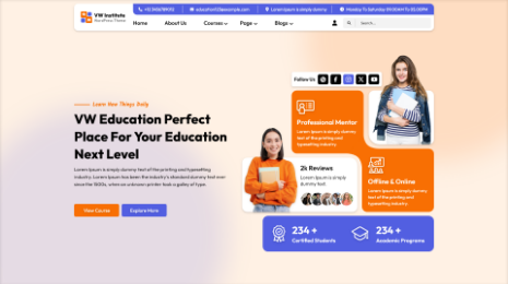
Free Education WordPress Theme:-

In the time on online education a strong online presence is necessary. That’s why this free Education Wordpress theme is the must for you. This is free mobile friendly Wordpress template. It is made specifically for the smartphones. So you don’t have to worry about its reach. This responsive Wordpress template is multipurpose because of the customization feature. With this feature you can make any changes into the website layout. You can even use this template for some other profession.
This theme is RTL and WPML supportive. These are the terms for foreign languages in WordPress. So with this your website will become multilingual.
Free Startup WordPress Theme:-

Our industry is evolving each day. Hundreds of startup projects take shape in the whole world everyday. In such tight race you need to be fast in acting and implementing your ideas into reality. We are here to take care of your first step to that. This free mobile friendly website template of free Startup WordPress theme will help you with it. In this free mobile friendly website template you get all the ingredients which will make it look professional. This theme has different sections and best WordPress themes to sort out the content. This slider will give you a place where you can attractively showcase the images about your project.
Free Dentist WordPress Theme:-

The website is supposed to be reachable for anyone and everyone. That’s why it has to be smartphone supportive. And that’s the exact reason why you must get this free mobile friendly website template. This template is specially made for Dentist profession. This free Dentist Wordpress theme is device friendly. You can operate it from any device and your viewers can access it from any device.
This template is made with bootstrap framework which makes it rigid on codes. At the same time same time it is changeable easily with the customization feature. With this feature you can use this template for something else as well.
Free Solar Energy WordPress Theme:-
The solar energy has to be preserved. Your work is the way to do it and our theme is medium for you. We with our free Solar Energy WordPress theme present you a way of contacting people. This free mobile friendly website template is a ready-to-use tool. By just adding content your website will be ready. Don’t worry about its foundation its made with bootstrap framework which gives it a robust functioning.
It also has different sections for contact details, newsletters, about us, social media and reviews. It has the most elegantly designed layout. Its decorated with stylish fonts. There is an option to enable or disable any section or best Wordpress template if you want to.
Free Photographer WordPress Theme:-

We present you free mobile friendly website template which is free Photography WordPress Theme which make this task easy. With this ready-to-use template you will be able to create website in minutes. Every aspect of this template is designed with a strategy and elegance. As strong as it is, it’s also flexible to changes.
The free Photography WordPress theme comes with sections and templates for your work projection. The sections are for social media icons, contact details, newsletters and blogs. It also has sliders with unlimited slides where you can add your photographs. This slider will create a slideshow effect on your website.
Free Video Vlog WordPress Theme:-

We present you Vlogging WordPress Theme. This free mobile friendly website template has definite space for your vlogs. You can present them as genres and write a little description. The designers have only for this purpose given different sections and templates in the theme. In these templates you can show your video blogs with a little script. The customization feature will let you enable-disable anything on the website layout.
With this website you will be able to stay connected with your fans officially. This responsive Wordpress theme is also designed exactly the way you would expect your website to be. It has social media icons and connections with which you can put content on all your social media profiles along with the website. Not only this but the template is SEO loaded. Which means it takes care of the ranks on search engine.
Free Painter WordPress Theme:-

Panting is depiction of life in its full colors. Your art is priceless, but to make money out it you need a website. This free Painter Wordpress theme is an easy way to have one rather create one. This free mobile friendly website template will help you showcase your work on its glory. It has sections and templates where you can put a little description below your art and make the sell. This theme has Woocommerce plugin which helps you to open an online store for your paintings.
This free mobile friendly website template has slider as well. You can create a different section for reviews also. When the viewers decide to buy, they can head to payment page and safely do the payment online. It has Woocommerce plugin to help you make it more secure.
Free Event Planner WordPress Theme:-

Life itself is an event and to celebrate it we need someone to carry the weight of planning. That’s why the event planner! As an event planner you need connections with people. And that’s why the website. This free mobile friendly website template of free Event planner WordPress theme is what you need. This is the best choice right now in the market. This free Event planner WordPress theme has hot you everything from flexibility to strength. It’s flexible with the customization feature but strong because of bootstrap framework.
With this customization feature you get a complete liberty to make changes in the layout. You can make these changes without changing the programming. Also it works good with the responsiveness and loads faster. This free mobile friendly website template is user and viewer friendly.
Free Writer WordPress Theme:-
For such powerful writer we provide you free Writer WordPress Theme. It is the perfect way to present your pieces to the world. With a website build with this free mobile friendly website template will get you good number of readers. This free Writer WordPress theme will give you a safe space to explore yourself and let others read into it.
This theme is totally translation ready. It has RTL and WPML support to make your content multilingual. With this feature you can take your work across the globe. Without SEO the website wouldn’t score much on the charts. You can even sort your writings by genres.
Free Pet Shop WordPress Theme:

This free mobile friendly website template is something that will take your pet shop places. This free Pet shop WordPress theme has different sections, sliders and best WordPress templates to sort content and images. It also has a slider where you can add almost unlimited images of pets. This slider will create a slideshow effect on your website. This free Wordpress theme has some in-built plugins that will help you with stuffs. It is also compatible with third party plugins.
The Woocommerce plugin will be there to make payment getaway more secure. Along with the contact form7 plugin which will help you create contact pages.
Free Eco Nature WordPress Theme:-
This free Eco Nature WordPress theme is the perfect medium for you to spread awareness into the world. It is the free mobile friendly website template. It has all the right elements that will make your website an easier spot to reach for ecological things. This free Eco nature Wordpress theme is responsive, has a rigid functioning and becomes flexible at the same time. The capable team of designers and coders have made this theme attractive and secure to use with the strong coding.
In this free mobile friendly website template you will get premium features for free. Among these premium features are the sections. You will get different sections for contact details, newsletters and social media.
Free Law Firm WordPress Theme:-
With the help of our free Law Firm WordPress Theme you can create your website in no time. This free mobile friendly website template will make sure you get the most reach. The team of designers have made this theme strong enough to retreat an attack. But responsive enough to satisfy the viewers. For this it has CTA that is Call To Action button for fast response.
This free mobile friendly website template is RTL and WPML supportive which makes it multilingual. With this feature your law firm will become global. It also has sections to sort the contact details, feedbacks, social media, newsletters and blogs.
Free Jewellery WordPress Theme:-
We present you free Jewellery WordPress Theme. This free mobile friendly website template is made exactly how you want it to be. It has all the glamour with the strong armor. The team has made this template with bootstrap framework. This give sit a rigid functioning. It’s responsive and flexible too. To make the payments more secure the template comes with Woocommerce plugin. With these features your online store for jewellery will be ready and safe.
The most important feature of them all is SEO. With this feature your website will also be ready for the search engines. It also has best WP templates.
Free Hotel WordPress Theme:-

This free mobile friendly website template is made considering your expectations. That’s the exact reason why you must buy this. This free Hotel WordPress theme has a very attractive layout. It has colors, fonts, style, elegance and sections for your food items. It will glorify your services even more. But if you want to give it your personal touch then you absolutely can with the customization feature.
To make the bookings and payment safe, this free hotel WordPress theme has Woocommerce plugin. Also the in-built contact form7 plugin will help you to create a contact page real quick. With social media by your side you won’t need anything else.
Free Furniture Carpenter WordPress Theme:-

This free Furniture Carpenter WordPress theme is what you have been looking for online. This free mobile friendly website template has everything that you need. With this ready-to-use free WordPress template you will be creating your website easily. The best part is that you don’t required to know about coding and programming for this.
It is made with the unbreakable bootstrap framework. With this your website will have a rigid functionality. But with the customization it becomes flexible to changes. With few simple clicks you will be able to make changes into the layout. This free mobile friendly website template is loaded with necessary elements. You won’t have to get them anywhere else.
Free Moving Company WordPress Theme:-

People have to know about your awesome work. You can’t limit your reach for the locals. With a website you can easily expand your limitations. This free mobile friendly website template is what will help you with it. This free Moving Company WordPress Theme is the best product we have. This template is designed and destined to meet your expectations. This template will give you enough space to describe the service and show it to people with photos and videos.
This free moving company WordPress theme has SEO which will take care of the search engines. With this your website will become ultimate spot for the customers.
WordPress Theme Bundle:-

All the free mobile friendly website templates by VWThemes are the bests in the industry. All the templates which are more than 110, are made to the best. But what if we tell you that you can get all of them at once? Yes it is possible! The VWThemes present you our precious WordPress theme bundle.
This WordPress theme bundle is obviously loaded with these free mobile friendly website templates. All of them have premium features. So don’t worry or overthink it. Just buy your WordPress theme bundle for only 99$!
Blogs Categories
Podcast WordPress Theme (Audio Podcast 2.0)

Latest WordPress Themes


Buy All our Premium Themes just at $119
