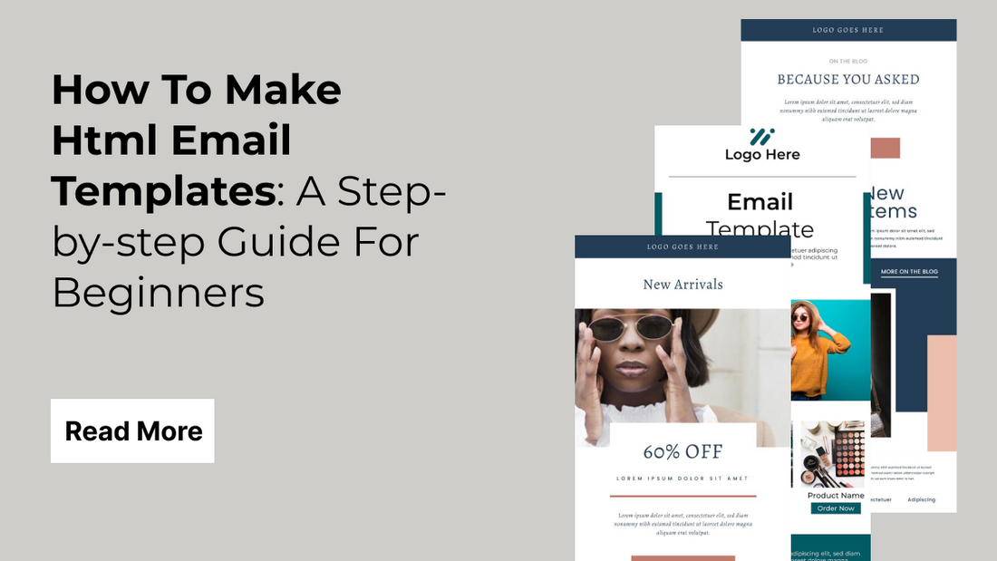
In today's digital marketing landscape, email remains one of the most powerful tools for businesses looking to connect with customers, promote products, and build lasting relationships. Whether you’re a beginner stepping into the world of email design or a seasoned professional aiming to refine your skills, this step-by-step guide is crafted to help you achieve success. "How To Make Html Email Templates: A Step-by-step Guide For Beginners And Pros" provides an in-depth look into creating visually engaging, responsive, and professional email templates that perform flawlessly across various devices and email clients.
In this guide, you will learn essential techniques and best practices that demystify the process of designing, coding, and testing your email templates. We break down the fundamentals, ensuring that you understand the importance of proper layout, inline CSS, and table-based designs that are crucial for compatibility. With clear instructions, practical examples, and troubleshooting tips, you’ll develop the skills needed to create emails that not only look great but also drive engagement and conversion. Many marketers often ask, "How to Make HTML Email Templates" to streamline their design process.
What Are HTML Email Templates?
HTML email templates are pre-designed email layouts created using HTML and inline CSS, specifically designed for Top email marketing platforms and communication purposes. These templates enable businesses and individuals to send visually appealing and consistent messages to their audiences while maintaining brand identity. Unlike plain-text emails, HTML email templates allow for the integration of images, graphics, colors, fonts, and interactive elements that capture the reader’s attention and drive engagement.
Using HTML email templates, marketers can create dynamic content that is both informative and visually engaging. They are typically structured using tables to ensure compatibility across various email clients, which often have limited support for modern web technologies. Inline CSS is used to style these templates because many email providers do not support external stylesheets. This ensures that the design appears as intended, regardless of the platform.
What Are The Benefits Of Using HTML Email Templates In 2025?
- Visually Engaging Content: HTML email templates allow you to design attractive layouts with images, colors, and animations, making your emails more engaging and impactful compared to plain-text alternatives.
- Stronger Brand Identity: Using consistent templates helps reinforce your company’s branding through fonts, colors, and logos, ensuring each email reflects a uniform and professional brand image every time.
- Advanced Personalization: HTML templates support dynamic content insertion, letting you personalize emails with customer names, preferences, and behavior-based suggestions to deliver relevant and targeted messaging.
- Enhanced Customer Experience: Personalization combined with clean design helps create a positive user experience, fostering trust and increasing the likelihood of recipients engaging with your emails regularly.
- Mobile Responsiveness: Responsive HTML templates adapt to various screen sizes, ensuring that your emails look great and function properly on smartphones, tablets, and desktop devices alike.
- Cross-Platform Compatibility: Inline CSS and modern coding techniques ensure your emails render correctly across different email clients like Gmail, Outlook, and Apple Mail without layout breakage.
- Improved Deliverability: Clean HTML and optimized code reduce the risk of emails being flagged as spam, improving inbox placement and ensuring recipients actually see your message.
- Faster Campaign Deployment: Pre-built templates eliminate repetitive design tasks, allowing you to launch new marketing emails quickly, which is perfect for fast-paced or time-sensitive campaigns.
- Scalability for Marketing Teams: Teams can efficiently scale their email outreach by using flexible templates that simplify the creation of multiple campaigns across different departments or market segments.
- Actionable Performance Insights: Many HTML email tools integrate with analytics platforms, offering open rates, click-throughs, and A/B test results to refine your email strategy based on real-time data.
What To Keep In Mind While Making HTML Email Templates?
When creating HTML email templates, it’s crucial to focus on compatibility, design, and clarity to ensure your message reaches all recipients as intended. First, keep in mind that different email clients such as Gmail, Outlook, and Apple Mail interpret HTML and CSS in various ways. This means relying on table-based layouts and inline CSS rather than external stylesheets to maximize consistency. Using well-established coding techniques, along with thorough testing via tools like Litmus or Email on Acid, can help you catch rendering issues before your emails go live.
Another essential consideration is responsive design. With a growing number of users accessing emails on mobile devices, it’s important to build templates that adjust seamlessly to different screen sizes. Utilize fluid layouts, scalable images, and media queries to create an adaptable design that remains engaging whether viewed on a desktop, tablet, or smartphone. Additionally, optimize your images for fast load times without compromising quality.
Maintaining consistent branding throughout your emails is equally important. Incorporate your company’s logo, color scheme, and typography to reinforce your brand identity and build trust with your audience. Organize your content with clear headings, short paragraphs, and strong call-to-action buttons to guide readers effortlessly through your message. You can also use our Tips for Mobile Optimized Design in order to create a mobile friendly template.
Lastly, always include alternative text for images and fallback options for elements that may not render as expected. By keeping these critical factors in mind, you’ll create HTML email templates that are not only visually appealing and on-brand but also reliable and effective across a wide range of devices and email platforms.
How To Make HTML Email Templates?
Below is a simple, step-by-step guide on How To Make HTML Email Templates that even beginners can follow:
1. Plan Your Email Layout
- Determine the Purpose: Decide whether your email is a newsletter, promotional offer, or a transactional message.
- Sketch Your Design: On paper or using a digital tool, draft the basic layout. Identify key sections such as the header (with your logo), body (with the main message), call-to-action (CTA) buttons, and footer (with contact details or unsubscribe links).
- Keep It Simple: Aim for a clean, single-column design that’s easy to read on both desktop and mobile devices.
2. Set Up Your HTML Document

The below code builds the base structure of your HTML email. It starts with the <!DOCTYPE html> declaration to tell email clients you're using HTML5, followed by the <html>, <head>, and <body> sections. Inside the head, we include two important <meta> tags. The first defines the character encoding (UTF-8) so that symbols and emojis render correctly, and the second helps your email scale properly on mobile devices using the viewport settings. The <title> element gives your HTML file a name if someone downloads it, although it won’t be visible in the email itself.
The <body> contains a table layout, which is essential for email design because most email clients (like Outlook or Gmail) don’t fully support modern layout methods like Flexbox or Grid. This full-width table acts as a wrapper with a light gray background. Inside it, there’s a centered 600px-wide table with white background and some spacing and padding to keep the content neat. This is where you will add your email content in the following steps, such as images, text, buttons, and footers. This setup ensures your email looks clean and consistent across all devices and inboxes.
3. Add Your Email Content”

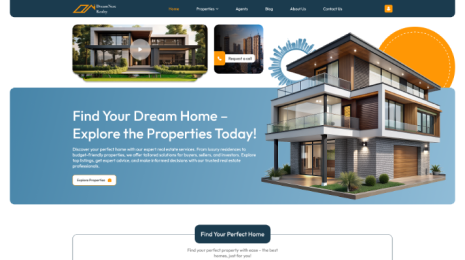
This code adds the core content of your email, which is what your readers will see when they open the message. First, we start with the header section inside a <tr> (table row). It uses an <h1> heading to display a bold, eye-catching title like “Introducing Our New Product!” This is styled to appear in the center with some padding for visual breathing space. Next comes the image section, which displays a product banner or hero image. This image is centered, has a maximum width of 100% (so it scales well on mobile), and slightly rounded corners to make it look modern.
Following the image, we have the main message section. This part includes a personalized greeting, a brief product description, and a call to action or highlight. The text is styled for readability with a font size of 16px and line height of 1.6, ensuring that it's easy to read on any device. Altogether, this section sets the tone, presents a visual, and gives enough context to engage your audience and guide them toward the next step.
<!-- Header Section -->
<tr>
<td align="center" style="padding: 20px 0;">
<h1 style="color: #333333; margin: 0;">Introducing Our New Product!</h1>
</td>
</tr>
<!-- Image Section -->
<tr>
<td align="center">
<img src="https://cdn.shopify.com/s/files/1/0695/8222/5655/files/dummy3.jpg?v=1747912960" alt="Product Banner" width="550" style="max-width: 100%; border-radius: 5px;">
</td>
</tr>
<!-- Message Section -->
<tr>
<td style="padding: 20px; color: #555555; font-size: 16px; line-height: 1.6;">
<p>Hello [Customer Name],</p>
<p>We’re excited to announce our latest product designed to boost your performance and simplify your workflow.</p>
<p>Take advantage of our limited-time offer and bring your business to the next level!</p>
</td>
</tr>
4. Add Any Media If You Want To
In this step, we’re adding media elements like images or GIFs to make the email visually engaging and interactive. In the example above, we use a simple <img> tag to insert a fun GIF. The image is set to a width of 500 pixels but uses max-width: 100% so it looks great even on smaller screens (like mobile devices). We also add a little message underneath using a <p> tag to give context or enhance emotional appeal.
Media in email templates can include product images, celebration banners, or animated GIFs that show how a product works. Just make sure the file size is not too large (ideally under 1MB) to ensure faster loading. Always use full URLs (like https://yourdomain.com/image.jpg) because email clients can't access local files. Including engaging visuals can dramatically improve open rates, click-throughs, and overall interaction.
Example:
<!-- Media Section -->
<tr>
<td align="center" style="padding: 20px;">
<img src="https://media.giphy.com/media/xT9IgG50Fb7Mi0prBC/giphy.gif" alt="Excited GIF" width="500" style="max-width: 100%; border-radius: 5px;">
<p style="color: #555555; font-size: 14px; margin-top: 10px;">We’re celebrating with you!</p>
</td>
</tr>
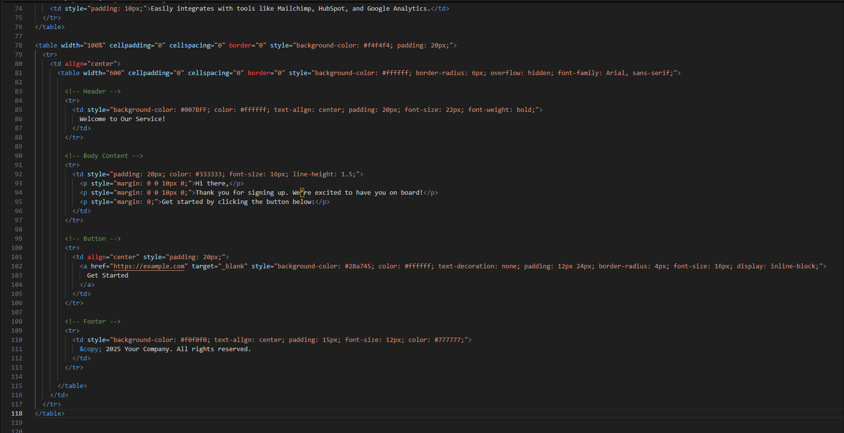
5. Add Inline CSS
Inline CSS means applying styles directly to each HTML tag using the style attribute. This approach is crucial in HTML emails because most email clients (like Outlook or Gmail) either strip away or do not support <style> blocks or external CSS. That’s why you write all formatting right inside the element for example, setting padding, background-color, and font-size directly in the tag.
In the example above, we style the header with a bold blue background and white text, making it pop visually. The body text has spacing and easy-to-read formatting, and the CTA button is styled with a green background and white text to encourage clicks. Using inline styles ensures your email looks consistent across different email platforms and devices. It might look repetitive, but it’s the safest and most reliable way to style emails in 2025 and beyond.
<!-- Header -->
<td style="background-color: #007BFF; color: #ffffff; text-align: center; padding: 20px; font-size: 22px; font-weight: bold; font-family: Arial, sans-serif;">
<!-- Body Content -->
<td style="padding: 20px; color: #333333; font-size: 16px; line-height: 1.5; font-family: Arial, sans-serif;">
<p style="margin: 0 0 10px 0;"></p>
<p style="margin: 0 0 10px 0;"></p>
<p style="margin: 0;"></p>
</td>
<!-- Button -->
<a href="#" target="_blank" style="background-color: #28a745; color: #ffffff; text-decoration: none; padding: 12px 24px; border-radius: 4px; font-size: 16px; display: inline-block; font-family: Arial, sans-serif;">
<!-- Footer -->
<td align="center" style="font-size: 12px; color: #888888; padding: 20px; font-family: Arial, sans-serif;">
<a href="#" style="color: #888888; text-decoration: underline;"></a>
</td>
6. Optimize Your Template for Mobile Devices
Making your email template mobile-friendly is essential in 2025 because most people check emails on their smartphones or tablets. If your email looks great on a desktop but is hard to read or navigate on a smaller screen, your audience might quickly lose interest or even delete your message.
How to make your email responsive using inline CSS:
Since many email clients do not fully support external or embedded CSS, responsive design in emails relies mostly on simple techniques and inline styles. Some important tips are:
- Use percentage-based widths rather than fixed pixel widths for main containers. For example, use
width="100%"on the outer table and a max-width on the inner container. - Set images to
max-width: 100%; height: auto;so they resize proportionally to smaller screens. - Use readable font sizes and comfortable line spacing to avoid cramped text on small screens.
- Stack elements vertically if needed instead of side-by-side layouts that won’t fit on narrow screens. This can be tricky with inline styles but can be handled by carefully structuring your table layout and avoiding overly complex designs.
Here’s a snippet from your template showing these principles in action:
<table width="100%" cellpadding="0" cellspacing="0" border="0" bgcolor="#f4f4f4" style="width:100%; max-width:600px; margin:20px auto; padding:20px; border-radius:8px;">
<tr>
<td align="center">
<img src="https://cdn.shopify.com/s/files/1/0695/8222/5655/files/dummy3.jpg?v=1747912960" alt="Product Banner" width="550" style="max-width:100%; height:auto; border-radius:5px;">
</td>
</tr>
<!-- Content continues -->
</table>
This setup ensures that the container scales with the screen size and the image shrinks proportionally, maintaining clarity and usability. Testing on actual devices or using email testing tools will help you confirm the mobile-friendliness.
7. Creating an Account on Klaviyo and Setting It Up

- Go to Klaviyo’s Website: Open your browser and visit https://www.klaviyo.com.
- Sign Up for a New Account: Click on the “Sign Up” button, then fill in your email, create a password, and enter basic information like your business name and website URL. Verify your email if needed.
- Complete the Initial Setup: After signing up, Klaviyo will guide you through setting up your profile, including your business details, time zone, and contact information. This info is important because it will appear in your emails as your company info.
- Connect Your Store or Platform (Optional): Klaviyo integrates with popular platforms like Shopify, WooCommerce, and BigCommerce. If you have an online store, connect it to sync your contacts and automate marketing.
- Navigate to Email Templates: In the Klaviyo dashboard, go to “Email Templates” from the left sidebar. Here, you can create new templates.
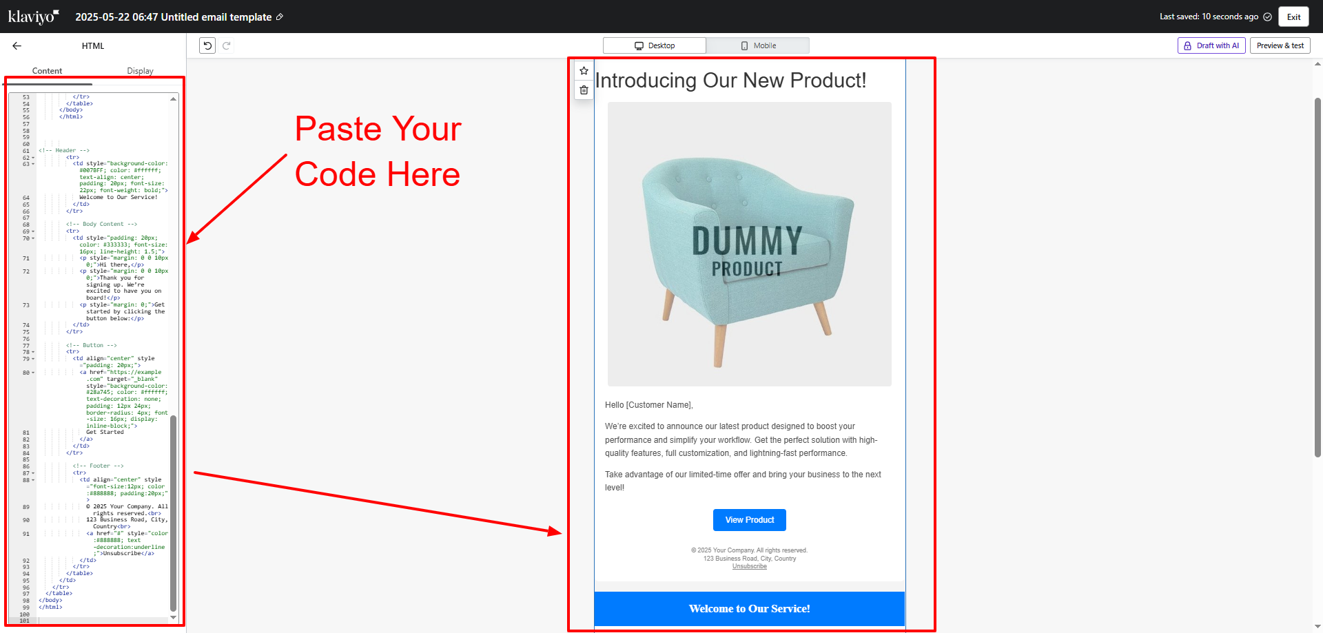
- Create a New Email Template: Click on “Create Template,” then choose “HTML Template” or “Paste Your Own HTML.” This opens an editor where you can paste your custom HTML code.
- Paste Your HTML Code: Copy the entire HTML email code you created (like the code you provided earlier) and paste it directly into the HTML editor in Klaviyo.
- Save Your Template: Name your template clearly (e.g., “Product Launch Template”) and save it. Your template is now ready to use for campaigns.
8. Testing and Publishing Your Campaign in Klaviyo

- Create a New Campaign: From the Klaviyo dashboard, select “Campaigns” and click “Create Campaign.” Choose the recipients or segment you want to send the email to.
- Select Your Template: When setting up the campaign content, choose “Use Template” and select the HTML template you just saved.
- Preview Your Email: Use Klaviyo’s preview function to see how your email looks on desktop and mobile views. This helps catch any obvious layout issues before sending.
- Send Test Emails: Click “Send Test” to send a copy of the email to your own email address or team members. Open the test emails in different email clients (Gmail, Outlook, mobile apps) to ensure everything displays correctly and links work.
- Check All Links and Images: Make sure clickable buttons, links, and images load properly and lead to the correct pages.
- Schedule or Send Your Campaign: If you’re satisfied with the test, schedule the email to be sent at a specific time or send it immediately to your selected audience.
- Monitor Campaign Results: After sending, track your email open rates, click rates, bounces, and unsubscribes in the Klaviyo dashboard. This data helps you improve future campaigns.
Fix Issues: Adjust any layout or rendering problems discovered during testing.
Validate Your Code: Ensure your HTML is clean and error-free to boost deliverability. If you find difficulties while creating these HTML Templates and you don't have any coding knowledge, don't worry We have handpicked the list of best email marketing plugins for WordPress that you can use to pick one for yourself that fits best for your website and then you can use that plugin to automate everything without any hustle. Email HTML Templates are used because they have their own benefits as we have discussed before and is built with minimum code and with fast loading speed.
Following these steps will help you smoothly create and launch your email campaigns with your custom HTML templates using Klaviyo, ensuring your messages look professional and reach your audience effectively. Ready for the next step or more details?
Conclusion:
This guide has provided you with a comprehensive roadmap on how to make html email templates that are both visually engaging and technically robust. By following our step-by-step instructions from planning your layout with table-based designs and inline CSS to optimizing for mobile responsiveness. You are now equipped to overcome the challenges of diverse email clients and deliver compelling, on-brand messages. Whether you’re a beginner or an experienced marketer, mastering how to make html email templates is an invaluable skill that can streamline your workflow and enhance your email marketing strategy.

The insights shared here, including the importance of clean code, thorough testing, and responsive design, are essential for building templates that drive engagement and conversion. With additional tips on incorporating pre-header text, accessibility features, dynamic content, and social media integration, you have the tools to create emails that truly resonate with your audience. Embrace these best practices, continuously refine your designs based on feedback and analytics, and you will see significant improvements in deliverability and campaign performance. Ultimately, knowing how to make html email templates not only saves time and resources but also strengthens your digital presence in today’s competitive landscape.
Blogs Categories
Podcast WordPress Theme (Audio Podcast 2.0)

Latest WordPress Themes


Buy All our Premium Themes just at $119
