
Introduction
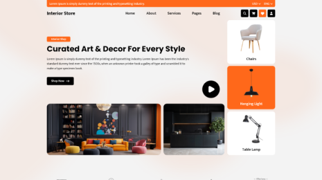
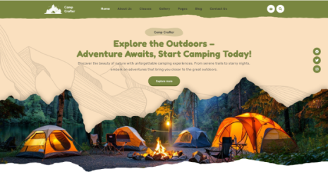
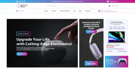
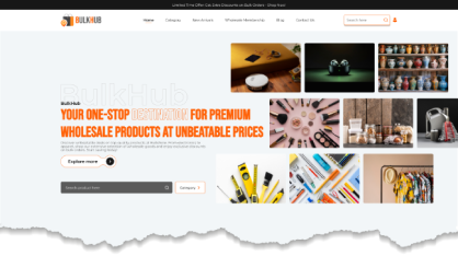
Call-to-Action Buttons force users to complete the action that you want them to perform on the website. Programmers embed buttons on the website to accomplish a final goal. When users click the CTA Buttons, they actually do the act that you wanted them to do for you, so sales increase. In short, it’s an inspirational button and a part of a marketing strategy that encourages the target audience to complete the desired action that you want them to. You can customize CTA Buttons in various styles and shapes according to your site's requirements.
Importance of Call-to-Action Buttons on a Website
The fundamental use of CTA Buttons is to direct them to perform a particular action they need to do next. So it plays a vital role. Without clear CTA buttons, users find it very difficult to buy a product or sign up for a service.
Actions that can be performed with call-to-action buttons
- Hit the link
- Leave a comment on social media
- Visit an eStore
- Complete the purchase.
Types of Call-to-Action Buttons
A website can include various kinds of CTA buttons. The type of CTA button depends on the niche and requirements of the site. Some of the general examples of a Call-to-Action button are:
- Buy Now
- Read More
- Find out here
- Sign Up
- Free Demo
- Free Trial
- Download Now
- Subscribe
- Learn More
- Submit
Sales Call-to-Action buttons earn clicks to complete the conversion. Today, in this article, we are going to explain the 10 best practices for creating effective CTA Buttons for your website. So let’s start to gain knowledge about these CTA buttons.
Get the clicks with the Call to Action Button's best practices
Implement the following tips and tricks and make your CTA buttons fruitful to grow your sales. Check out the 10 best practices and create wonderful CTA Buttons.
- Employ action-packed text
You must have seen different interactive words on CTA buttons, like ‘Take This Course’ on educational websites. It’s a great example of what's relevant to offer.
Also, it invites the user and inspires them to avail themselves of a particular course. Such words really impact the user’s mind. Text on Call-to-Action Buttons should be bold and directive.
You need to replace the uninteresting verbs like “Submit” and “Enter” with verbs like “Get”, “Reserve”, and “Try”.
Your Call to action should be accompanied by the wording that is related to your offer, such as “Reserve Your Seat”, “Try Out Free Trial”, “Trial Download”, “Book an Event”, etc.
- Make use of catchy and compelling colors
Call-to-Action Buttons are one of the most useful elements of the whole website. It has an extremely important place on the site. Hence, it should look compelling and captivating. Colorful buttons attract the user’s attention easily. So selecting a color for the CTA button is a careful consideration. Prefer using a color palette according to your website.
Generally, orange and green colors are supposed to be the finest colors to make CTA Buttons attractive. It’s not mandatory to use these two colors alone. You can pick any color that suits your whole website's design. Contrasting colors adorn the site. The squint test can help you select the color for the CTA Buttons.
- Elegant Shapes
The form of the button is quite important when creating an ideal call-to-action button. You need to decide the shape of the button, whether you like to embed a button with square edges or with more rounded corners. Determining which approach performs the best in this situation is difficult, as both approaches are widely used and can succeed in various contexts. In the end, you will have to experiment with forms to find which ones suit your business the best.
- Large font size with credibility
Your button wording should be readable at a glance, but not so huge as to be distracting or threatening. Although it may seem preposterous to suggest that reading huge text causes anxiety or discomfort, many users do have a subconscious aversion to intimidatingly large letters. The size of your button text should be sufficient to capture attention without totally obscuring the remainder of the material. It should fit the rest of the content.
- The button Text shouldn’t be longer
Button text of more than 5 words looks very unprofessional. Ideally, you should use two to five words on a Call to Action Button. Keeping a Call to action short and sweet looks appealing. Stretching out the button text is not recommended at all.
- Make people feel a sense of urgency
In the earlier section, we studied how Calls to Action are used to encourage visitors to perform a particular action. For this, you need to make the people feel a sense of urgency so that they can click the button to hurry and complete the action.
Let’s give you some examples:
- Sign Up and Get 50% Off. Today Only!
- Download the E-Course app for $26!
- Register for a free seminar Now!
- Ticket Prices will go up; Hit Now!
Here, the words now and today show urgency and have the power to make people hurry to complete an action, which is beneficial for any business.
- Design the hierarchy of Call-to-Action Buttons appropriately
Sometimes, your website consists of multiple CTA Buttons that are different from the conversion buttons. So you need to keep them separate. Those buttons need less styling and attention-fetching features than the primary Call-to-Action Buttons.
You can use a monochromic or grayscale color for non-CTA buttons on the website. The primary CTA Buttons must be the largest and look vivid. Maintaining the hierarchy of CTA and non-CTA buttons can avoid complexities and confusion in the user’s perception. It can be achieved by clarifying the color schemes and shapes of the buttons.
- Make use of value proposition
Considering that "The Proposition" is widely regarded as the most effective element to include in CTA buttons, It is one of the encouraging features that captivates users and makes them hit the button with their mouse pointer. Words like “Free” indicate the value proposition. Instead, you can display a proper value with an offer.
Example: "Get the eCopy at liberty," "Download the eCopy at no cost." Liberty indicates Free, and no cost are very enticing words that attract users immediately.
- Insert the additional information
In certain scenarios, you need to insert some additional information in your Call-to-Action button wording. For instance, a free trial button can include a smaller text message that reads "30-day trial, no credit card" underneath the larger text "Start Your Free Trial" button. Users will be enticed to go through and start their trial since this information is important.
Including such additional information on the CTA button is beneficial for the user and the business as well. The valuable information inspires the user to press the trial CTA button and perform an action. It is not always mandatory to mention or include extra information. Some websites that show testimonials or any other service-provider brands need to provide them for the customer’s clarification.
- Check the Add to Cart buttons
In numerous instances, individuals encounter scenarios where they need to decide between the effectiveness of the 'Add to Cart' call-to-action button on online shopping platforms. It has been established that the optimal allocation of time should be directed towards A/B testing the 'Add to Cart' and 'Purchase' buttons on eCommerce websites. This is grounded in factual evidence. Alternatively, one might lean towards utilizing an eCommerce WordPress Theme to ensure a seamless user experience. Even a minor change in the cart button can affect conversion rates significantly.
So, make sure to provide buttons for additional payment methods, such as PayPal.
Apart from these 10 practices, one more thing you need to keep in mind is the appropriate placement of Call-to-Action Buttons on a website. It has to be placed at the bottom or on the right-hand side of the content. Making the CTA button appear appropriately provides the best user experience. You need to understand the after, before, up, and down positions on the content where the CTA button is actually needed.
Best Call-to-Action Buttons examples
- Sign up in 30 seconds.
- Get started without a credit card.
- Lock in my free account.
- 2 min. demo.
- See how.
- How do we do that?
- Take me to the blog!
Short steps to creating effective Call-to-Action Buttons
- Make the CTA buttons attractive
- Choose catchy colors for CTA buttons
- Keep the CTA text brief.
- Place the CTA buttons properly on the webpage.
- Include additional or supportive text on the CTA button when required.
- Test whether the CTA buttons are working fine or not, especially on eCommerce websites.
- Concentrate on offering value.
- Structure the CTA text with a minimum of words.
- Test the placement, color, style, and text of the CTA buttons.
Conclusion
Call-to-Action Buttons serve as valuable tools, actively guiding users toward their next steps and providing clear direction on where to proceed and what actions to take. The clear directive statements on the CTA Buttons streamline the user experience. Your audience is less likely to leave your website out of misunderstanding or overload if your call to action is straightforward. You just need to structure, design, and place it properly. Furthermore, it should seamlessly integrate without disrupting the organic progression of your website.
The WordPress theme bundle brings together a collection of meticulously crafted website themes that cater to a diverse range of needs. In relevance to the 10 Best Practices for creating effective call-to-action buttons, these themes seamlessly incorporate these principles to maximize user engagement and conversions. Each theme within the bundle strategically positions CTA buttons with compelling and action-oriented text, utilizing contrasting colors to make them visually prominent. The buttons maintain a consistent design throughout the website, maintaining a coherent and intuitive user experience. They optimize the placement for accessibility and visibility, often positioning them near valuable content. The themes also prioritize responsive design, ensuring that these buttons remain impactful across various devices and screen sizes. With clear and concise messaging, a sense of urgency, and seamless integration into the overall design, the WordPress theme bundle exemplifies how effective CTA buttons can significantly enhance the user journey and drive desired actions.
Blogs Categories
Podcast WordPress Theme (Audio Podcast 2.0)

Latest WordPress Themes


Buy All our Premium Themes just at $119
