WordPress Mobile App Theme
WordPress Mobile App Theme

Explore more with WordPress Theme Bundle, The Ultimate Collection of All our 500+ Premium WordPress themes Just at $119
Price:
$59 $40
_200x.png?v=88003991796551919761765958892)
_120x.png?v=78328030305413727841765958892) Excellent 323 + Reviews
Excellent 323 + Reviews
Version:
6.8.+
WP THEME BUNDLE
Get Access to More Than 500 Premium WordPress Theme Including This Theme at Just $119
Extra 20% OFF on Bundle

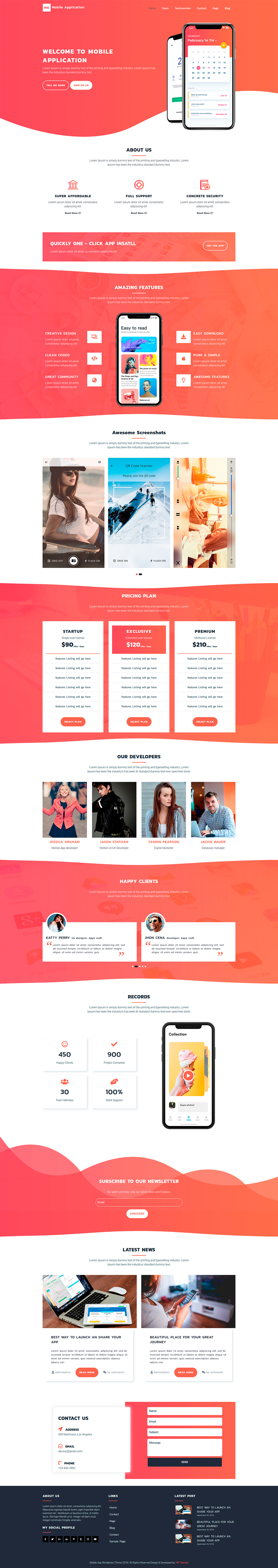
Why Purchase Our WP Mobile App Theme?
Best WordPress Mobile App Theme For Mobile App Promotion.
Mobile applications are now an important part of our lives as the advancement of mobile devices has made our life a lot easier than we can hardly survive without using them. The unique mobile apps that are coming to the market have made it simple to manage things. From entertainment, games, to event managing tools and learning; there is an application for everything you need. If you are also into app development and want to bring your applications to the market; merely building an app is not enough. You need to get an online presence and for that, a WordPress Mobile App Theme is going to help you.To get a website that showcases all the features of your mobile application and its different utilities, our theme will provide an excellent layout. It will bring all your apps into the limelight and positively complements your marketing efforts. The design it projects on the online platform will inspire the target audience and increase the curiosity among them for exploring the details of your new and upcoming mobile applications. You will also find WordPress mobile app template inbuilt into the design.Premium Theme Features
Fully responsiveness

Highly responsive design and structure that comes in handy when dealing with traffic.
Live Customizer

Customize the site through theme customizers, which allows for addition and removal of sections.
Translation Ready

Our themes are omnilingual, much like Batman. They can speak and translate form or to any language.
Woocommerce

Woo commerce & SEO compatible themes that will boost your business and improve traffic.
SEO optimized

SEO optimized themes will improve your rank in SERP and visibility to web crawlers.
Professional Support

VWThemes come with a year long support subscription with our professional support team.
Color Pallete

Customize text, colour, fonts of peculiar sections with the aid of our helpful theme customizing options.
Theme Bundle

All Themes available in WordPress bundle. Get 500+ themes in one WordPress Theme bundle

WordPress Mobile App Theme Features
- Theme options using customizer API
- Responsive design
- Favicon, logo, title, and tagline customization
- Advanced color options and color pallets
- 100+ font family options
- Simple menu option
- Sticky header
- SEO friendly
- Pagination option
- Compatible with different WordPress famous plugins like contact form 7
- Enable-Disable options on all sections
- Well sanitized as per WordPress standards.
- Responsive layout for all devices
- Footer customization options
- Fully integrated with the latest font awesome
- Background image option
- Custom page templates
- Allow setting site title, tagline, logo
- Sticky post & comment threads
- Parallax image-background section
- Customizable home page
- Footer widgets & editor style
- Title banner plugin functionality
- Social media feature
- Main banner with call to action section
- About us section
- Services section
- Team section with custom post type
- Testimonial section with custom post type
- Contact us with contact form 7
- Newsletter with contact form 7
- Blog post section
- Contact page template
- Shortcodes for the custom post type
- Contact us widget
- Social icons widget
- Easily Customize WordPress Theme
- Change site title color
- Custom Widgets
- Advanced Theme Options
- Call to Action Buttons
- Regular Updates
- Full-width template
- Sidebar Widget Area
- Custom Google Fonts
- Custom Link Colors
- Home Page Sections
- Custom Sections
- GPL Compatible
- Excellent Core Web Vitals
- Professional support