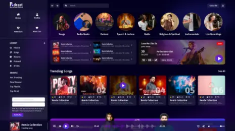
Responsive web design, in short RWD, was punched by Ethan Marcotte in 2010. It is actually an approach that compels web pages to respond to different devices or screen sizes. With Responsive web designs, even if you craft the website for the web, then there is no need to fabricate new designs for mobile devices or for variable screen sizes like the iPhone, iPad or any other devices. Only with a single responsive web page, its view will be good on all devices. Responsive Web designs are so necessary for creating Websites. By this, you can give a better user experience to visitors as it makes the site, mobile-friendly. Also, when you are building a website with a responsive web design then it will automatically improve your rankings in search engines. Making a responsive website will save your cost for making two different websites for web and mobile. It will also easy to maintain a single responsive website rather than maintaining two different websites. It will also make your site more flexible as a user can easily change the pages and there is no need to resize, scroll, zooming, etc. This article is all about Responsive Web Design guidelines for beginners.
So, Let’s Have A Quick Look Towards The Responsive Design Guidelines For The Beginners.

1. HTML and CSS
The very first thing that comes in responsive web design guidelines is the combination of CSS and HTML. The basic building block of responsive design is the amalgamation of HTML and CSS. This are the two players that controls the layout and control of a Web page in any web browser. HTML is mainly responsible for the content, structure and elements of a webpage. You can also control the primary attributes like height and width within HTML but it is not considered as the best practice. On the other hand, CSS i.e. cascading style sheets is used for editing the design and layout of the elements which you will include on a page using HTML. You can include CSS code in a <style> section of a HTML document. You can also add it as a separate stylesheet file. So, to make a website responsive you should have the basic knowledge and idea of HTML and CSS.
2. Media Queries
Second, in the list of responsive web design guidelines is CSS Media Queries. It is the another part of responsive design. This media queries are currently enjoying fair support across different modern browsers. CSS3 media queries allows you to assemble the various different data about the visitors to the site and basically uses it to apply CSS styles. So for our motive, we will focus on the feature of min-width media. This will allow us to apply specific CSS styles when the browser window will drop, down below a particular width. This Width can be specified. Below is the media query that we will use to apply some styling to mobile devices.
@media screen and (min-width: 480px) {
.content {
float: left;
}
. social_icons {
display: none
}
// and so on…
}
3. Responsive Frameworks
Responsive frameworks are one the major things that comes in responsive design guidelines. When you Start your work with the Responsive web designing by creating your own media queries then for someone it will seem to be the large task to do. So, there are others way tooAnother rationale for not craftingeating your own responsive grid. There areis to use one of the many responsive grids that are available in the Internet Worldonline. You can use the most popular responsive frameworks like Bootstrap and ZURB’s Foundation. and Bootstrap are just some of the most popular responsive frameworks you could consider using.
4. Flexbox Layout
Flexbox layout provides a dynamic and flexible feature to create Responsive website. So, it also comes in the responsive web design guidelines for the beginners. Flexbox is a CSS module that is designed that provides efficient and effective way to lay out the multiple elements, even when the size of the contents is unknown inside the container. The container of the flex expands the items to fill free space that is available to prevent overflow. The flex containers constitute various unique properties, for example- justify-content, this thing can’t be edited with a regular HTML element.
5. Responsive Images
A very common and big problem that most developers come across is to create a website where images will automatically scale without losing the actual resolution. A very quick and the best way to make your images automatically scale to the different screen sizes accurately can be done by using the max-width property with 100% as a value. A max-width value of 100% will make sure that the image or any media will scale to differing screen sizes. There are other ways too to create a flexible image like creating the sliding images, foreground images which automatically scales with the layout and by hiding or revealing the portions of the images. So, as the responsive images is one of the important factor it also comes in the list of responsive web design guidelines for beginners.
6. Speed
When you came across the responsive design guidelines for the beginners then speed is the prior thing you must consider. When you are trying to craft a responsive design for your website, one factor should always be a priority and that is the loading speed. According to the survey pages that takes the loading time of 2 seconds have the bounce rate of 9% average, while the pages that have the loading time of 5 seconds can lead a bounce rate of 38%. If your approach is to make responsive design for your website, then you should give an utmost importance to the loading speed. There are many ways by which you can make your webpages faster. Implementing the caching, using an efficient and effective CSS layout, keeping away the render-blocking JS and optimizing your image are the best ways that you can use to load your page faster.
Conclusion:-
In the modern era, all the new websites and applications goes after the trailblazing approach towards web designing. Responsive Web Designing is one of the technology that will be here for a very long time. Yes, it is surely possible that there will be some new innovations, creativity, and ideas that might change the way to pull of this scenario but the responsive nature of the web development looks very secure for the long time. We can say that RWD is the present and future of the internet world. With the increasing number of the smartphones, the desktop and PC’s web developers must start using sleek mobile website designs. However, today’s web developers work directly with responsive frameworks and templates, still they must understand the proper concept to rectify any imperfections smoothly. This Imperfections can be easily solved through the above responsive design guidelines.
You will find the best collection of WordPress themes on our website VWthemes. Check it out today to avail WP themes on sale.


