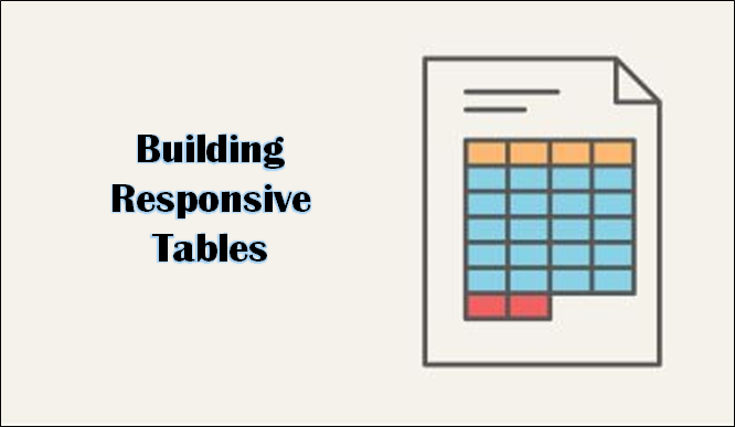
Firstly, let us understand the role to Create responsive tables in a short and well-explained way. Responsive tables are majorly used in a website to deliver enormous information associated with any particular subject. To be more precise with the readers, the main objective to build responsive tables is to help visitors on the page to understand a larger amount of information in a well-organized manner.
These tables correctly deliver huge information or data to the reader in a more systematic manner and understand things included in a better way. Our WordPress themes are regularly updated so that your website is always compatible with the latest WordPress version.
How To Create Responsive Table?
Now, to view the responsive table requires a laptop or a personal computer. Making tables responsive to the readers, the builders create these tables in proper length and width of the rows and columns that are easily seen on desktop screens or the notebook/laptops. Hence, the display of the responsive tables may not be viewed properly in smartphones, irrespective of any good brand. Mobile phones are not able to display such tables wider and clearer to the user.
When you Create responsive tables, it is important to build a set of rules for the initial table or the original table. This set of rules determines the division that is dependent on the size of the display. This simply means that in case a visitor or user is accessing the table on a smaller device than the required one, the responsive table will reciprocate by reformatting so that it properly fits the size of the screen. The responsive tables are usually reformatted using the addition of a scroll bar or also stack the information.
When you Create responsive tables and make them more responsive, the builders would never want to shrink all the information in rows and columns or cells according to the size of the screen, as this can make the responsive table look unsystematic or unreadable. Luckily, the responsive design is not very complicated to achieve. Also, All Customizable and premium WordPress themes are available on VWthemes.
Create Responsive Table Without The Use Of Plugins
There are mainly 2 approaches for making the table responsive, mainly in WordPress. Let us understand and know about the procedure of getting this task done with no plugin at all. This needs good coding knowledge; particularly regarding Cascading Style Sheets, abbreviated as (CSS).
It is also recommended to perform the same task in staging or also the development environment, instead of your real-time website, unless the builders design the table that will be reliable.
Initially, for making responsive tables, builders need to set a proper format for responsive Cascading Style Sheets. After this process, builders need to add custom tags to the Cascading Style Sheets. The third and the last step say the testing responsiveness of the table in WordPress.
There are 2 possible approaches to building responsive tables in WordPress:
Creating Responsive Tables in WordPress requires two crucial ways to deal with the issue. Either the builder can make use of the plugin or he or she can perform this manually. With good research and exploration, both the approaches are mentioned below:
Make Use Of A Plugin To Create Responsive Table
There are several plugins that help the builders to make the tables in WordPress more responsive. One of the highly preferred plugins is Ninja Tables. Using Ninja Tables, the builders can easily access the advanced characteristics or features for mobile displays like piling up the table’s columns, hiding particular columns, and others.
Once the builders install and activate properties of the said table, they can apply and navigate to ‘Ninja Tables’ – ‘All Tables’ for creating the new one.
In the table editor, creators or builders just need to click on the ‘Add Column’ option in order to start the creation of columns. For every column, the builders will have to select the option of ‘Hide’ to hide the complete column on mobile devices or also personal computers/laptops.
Once all the columns are created, go to the ‘Add Data’ button to build the rows of the table. Once this is accomplished, builders can switch on to the ‘Table Design Tab’. On this, builders can preview or see the complete display of their tasks done till now using smartphones, tablets, or personal computers with the help of buttons on the table (above).
Builders can also produce the stackable smartphones display through the selection of the ‘Enable Stackable Table’ checkbox and also by specifying what type of devices to apply this amazing feature. So, finally, builders can publish the4 recently built table. Make use of ‘Ninja Table’ in the Block Editor.
While the plugins like Ninja Tables can assist builders to Create responsive tables in WordPress, they mostly need the builders to edit every table manually. This mostly consumes a lot of time. And owing to this, builders would definitely want to deal with the problem with the help of custom code.
Just Change Or Edit The Theme Files To Make The Tables More Responsive
Another solution to make tables responsive with hands is simply to apply or incorporate horizontal scrolling. For performing this action, the builders are required to add a particular class to Hypertext Mark-up Language (HTML) tables, the builders wish to make the table more responsive like <table class=”responsive-yes”>. You can then add the same code to the theme. Builders can add their code to their required theme’s style.css file.
This eventually sets a division with the help of the ‘max-width’ feature. With the width of the viewpoint is below that particular size and then the builders’ table will automatically scroll. Nevertheless, this is not the most efficient solution for the display tables on smartphone devices.
On the other hand, the builders can also make use of (CSS) Cascading Style Sheets for stacking the table’s columns. This is one of the favorite options for most builders to Create a responsive table. The features of this option include its higher readability on different screens of various sizes, which makes it easier for the readers to communicate with the tables. Also along with learning about how to fix wordpress post 404 error with VWTHEMES
Two Major Things To Apply To Adopt This Change
- Add the <thread> and <tbody> tags to the WordPress tables, and
- Add the CSS snippet code to the style sheet of the theme for configuration of the division as well as re-arrange the builder’s table’s column. So, don’t forget to make table responsive using CSS!
Initially, the builder requires builders to open the Block Editor and choose the table to perform tasks on. Then click on the 3 dots option or icon shown in the block toolbar and go to the ‘Edit’ as an HTML option.
Editing the builder’s table’s HTML with the assistance of Block Editor could be slightly tricky as it does not comprise spaces. In short, builders would surely wish to wrap the column headings with <thread> tags and the remaining content of the table using <tbody> tags as well. This ultimately sets the division at 600px and stimulates a re-arrangement when builders view the table on smaller screens.
The only dark side or the drawback of this technique is that builders must and have to add the <thread> as well as the <tbody> tags to every table with hands (manually). This is the easier approach to allow the stackable displays using Ninja Tables. Rather, it is recommended to check the JavaScript that allows the builder to automate the entire process.
Builders can also type in the cells of the table once they give permission to do the same in the table’s rows and columns or in short, the cells. They can automatically modify the size on the basis of how much content will be written in each cell.
If the builders prefer the size of the cells which will be fixed-width, then builders can easily set this option on the right side of the screen. Builders can also add if they require a footer and header section in this place. For instance, if builders have added a header for the table, and are also willing to set the background color, they can easily go to the ‘Color Settings’ option and select the color according to the page. Users can also delete columns and rows in the same manner.
They simply have to go to the cell in the column or the row, which they wish to remove any cell. To remove or delete a cell from a column or row, click on the ‘Delete Column’ or ‘Delete Row’ from the ‘Edit Table’ menu given on the screen.
By default, the next column of the row is aligned to the left. One can easily alter or change this by going to the option of the column and clicking the ‘change/column alignment’ button. Builders can also change alignment.
Also, the alignment can be changed of the entire table in the page or the post by going on the ‘Change Alignment tab’, which will select the desired option from the list. Builders just have to note down these amazing options that will help the table display beyond the normal borders of the post field.
Most of the cells might appear odd on the website, hence, make sure to first preview the page’s post and re-check how they appear. Appearance matters, when it comes to the website since everyone is going digital and especially the high penetration of usage of smartphones and increasing demand for more and more electronic devices, and of course rise in innovations, especially in the electronics and communication sector.
Tables Making Use Of TablePress Plugin Also Hold Great Dominance
To Create Responsive Table, Table Press is one of the best WordPress plugins for tables in the marketplace. It is absolutely FREE and enables the users to create as well as manage tables. Another best thing about this is that builders can edit tables separately and also add numerous rows.
Moreover, TablePress can become essential if users are making use of the traditional version of the WordPress editor that lacks the functionality.
The two main fundamental ways, the user can select about making table responsive in WordPress are:
- Make use of the most highly used plugins to hide the columns on mobiles-like devices for separate tables.
- Modify the theme files to make them scroll and stack columns automatically.
Give No Excuse To Use This Wonderful Option
If you think to be dependent on tables to represent data on the website, then users must make sure that they are completely responsive. Here to help you out with the most efficient and successful option themes. The traditional or default WordPress tables will show on smartphone-like devices.
Nonetheless, depending on the theme of your website, they might not adjust properly to the smaller screen like mobile phones and you also will not be able to transfer or convey information as successfully.

Along with this also have a look at our WordPress Bundle for stunning themes at greater prices with greater support.


